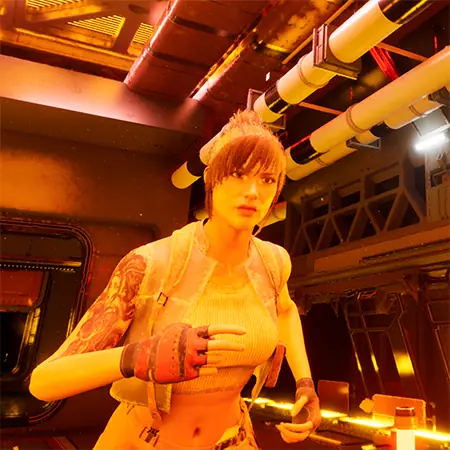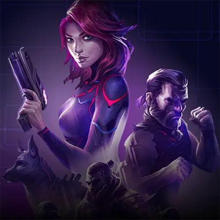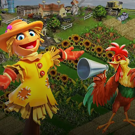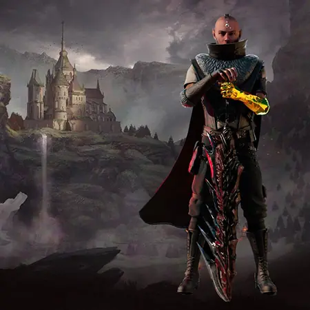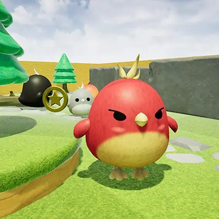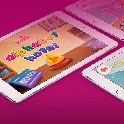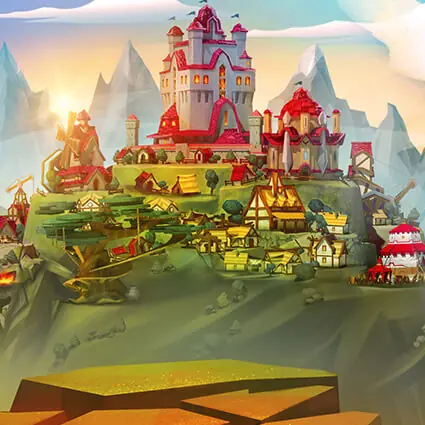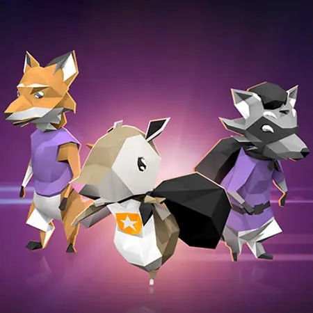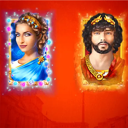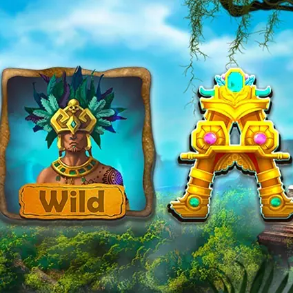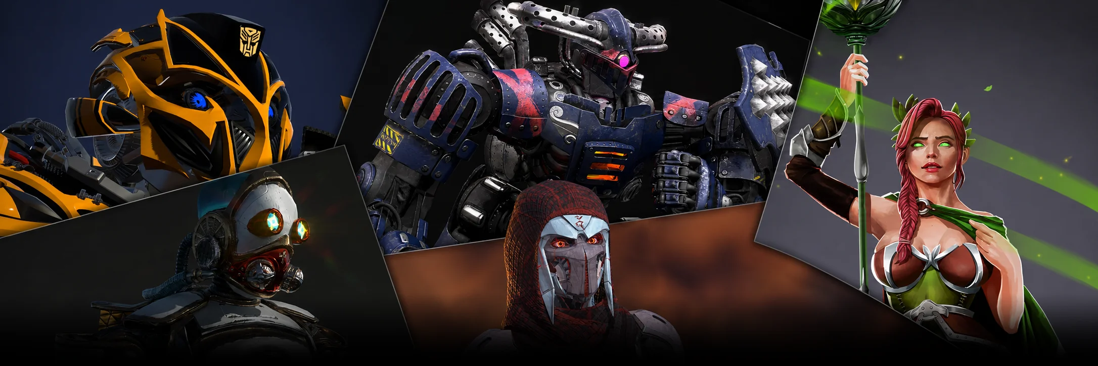

Color in game characters communicates personality, role, and intent before a single line of dialogue is heard. The color psychology of game characters guides how players read heroes, villains, mentors, and sidekicks: warm reds signal aggression and passion, cool blues suggest calm or distance, greens carry nature or corruption, and dark values mark threat or mystery.
What color in game characters communicates to players
Color is the first visual signal a player processes. Before silhouette, before animation, before voice acting, hue and saturation tell the brain what to expect from a character. The color psychology of game characters draws on broad cultural conditioning, perceptual research, and decades of game-design convention. A bright saturated palette reads as approachable. A muted dark palette reads as threatening. A high-contrast accent on an otherwise neutral character reads as the focal point the player should track.
On a production level, color also handles three practical jobs: it separates the player character from enemies in busy scenes, it codes faction or class in multiplayer titles, and it supports readability under different lighting conditions. Research on color-in-context (Elliot and Maier, ongoing work indexed in the NCBI peer-reviewed archive) confirms that color meaning is not fixed: it shifts with surrounding context, genre, and culture. That makes early palette decisions a strategic choice, not a late-stage polish task.
Hero, villain, sidekick: archetype color palettes
Most playable heroes lean blue. Sonic, Mega Man, Link in his classic green, Mario in red and blue, Samus in orange and red, Pac-Man's yellow, the recurring pattern is a primary or secondary hue that pops against environment art. Blue protagonists dominate because blue tests as trustworthy and competent across most player demographics, and it reads cleanly against natural greens, browns, and grays in level geometry.
Villains run colder, darker, or more saturated than the rest of the cast. The deep blacks and bruised purples on Kratos's enemies in God of War, the acidic greens on classic Bowser sprites, the bone-white of Sephiroth, each palette pulls the eye to threat. Sidekicks usually sit one or two notches less saturated than the hero so they read as supportive rather than competing focal points.
| Archetype | Typical palette | Reads as | Catalog reference |
| Hero | Blue, red, or warm-bright primary | Trust, energy, focal point | Sonic (blue), Mario (red/blue), Aloy (red accents) |
| Villain | Black, deep purple, bruised red, acid green | Threat, corruption, alien intent | Sephiroth (white/black), Bowser (green/orange) |
| Mentor | Muted earth tones, gray, deep blue | Wisdom, distance, stability | Auron (red robe muted), Zelda elders |
| Sidekick | Lower-saturation echo of hero palette | Support without stealing focus | Tails (orange), Yoshi (green) |
| Antihero | Mixed warm-cool with high contrast | Moral ambiguity, friction | Kratos (red on gray skin), Travis Touchdown |
These mappings are tendencies, not rules. Plenty of memorable characters flip the convention deliberately, that contrast is precisely what makes them stand out.
Cultural variation in game character colors
Color meaning shifts by region, and global releases have to plan for it. White reads as purity and weddings in most Western markets but as mourning and funerals across much of East Asia. Red signals danger and stop in Western traffic conventions, yet it signals luck, celebration, and weddings in China. Purple has royal associations in Britain and Japan, mourning associations in Brazil and Thailand. The color psychology of game characters travels unevenly across markets, and a palette tuned for one audience can confuse another.
For studios shipping to multiple regions, the safer pattern is to anchor the protagonist on a globally neutral hue and reserve culturally loaded colors for context-specific characters or events.
| Color | Western | East Asian | Latin American / other |
| White | Purity, peace, weddings | Mourning, death, funerals | Peace, purity, surrender |
| Red | Danger, passion, stop | Luck, prosperity, joy | Passion, blood, sacrifice |
| Black | Mourning, mystery, elegance | Authority, prestige, formality | Mourning, mystery |
| Green | Nature, growth, money | Health, harmony, prosperity | Forests, hope, death (specific contexts) |
| Purple | Royalty, luxury, magic | Wealth (Japan), nobility | Mourning (Brazil, Thailand) |
| Yellow | Caution, optimism, energy | Imperial color (China, historical), happiness | Mourning (Egypt, historical) |
Color and contrast for readability and accessibility
Roughly 8% of men and 0.5% of women have some form of color vision deficiency, mostly red-green confusion. If a hero is red and the most common enemy type is green, those players cannot distinguish them by hue alone. Production teams that take accessibility seriously layer at least three signals onto faction identity: hue, value (light vs dark), and shape or silhouette.
Contrast against the environment matters more than absolute color choice. A red character on a green forest level reads sharply. The same red character on a red desert level disappears.
- Test character palettes in greyscale to verify silhouette and value separation hold up.
- Run palettes through deuteranopia, protanopia, and tritanopia simulators (built into most DCC tools).
- Pair every color-coded faction with a secondary signal: shape, icon, or animation pattern.
- Check character readability at the smallest expected screen distance (mobile thumbnail, minimap, target reticle).
- Avoid pure red on pure green; offset hue or value to keep separation for color-blind players.
Black: threat, mystery, and modern villainy
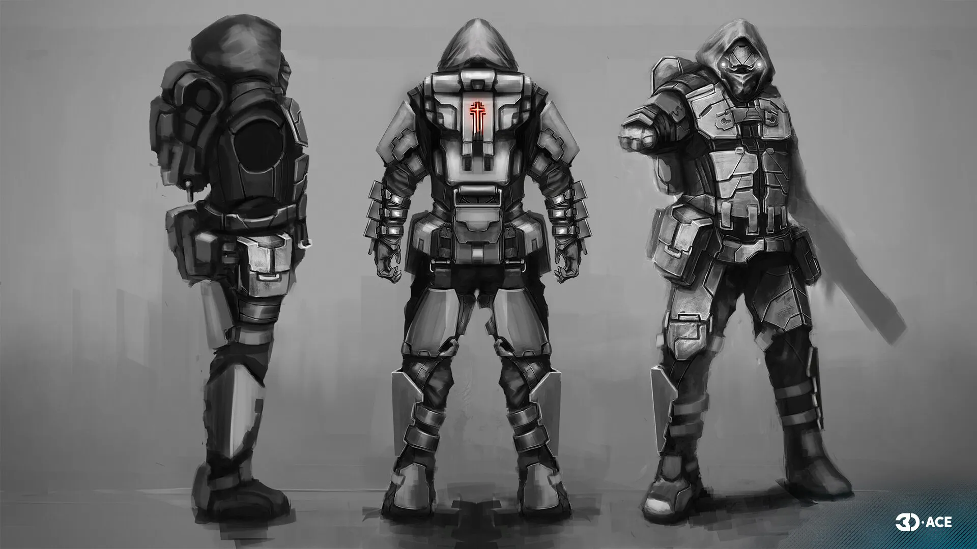
Black remains the textbook villain color across most game genres. The visual logic is simple: black absorbs light, hides expression, and reads as withdrawal from the social signaling that warm hues provide. Shadow figures, plague masks, hooded silhouettes, all lean on the same convention.
Modern character design has loosened the rule. Plenty of protagonists wear black armor as a sign of competence rather than evil: Samus's varia suit reads dark, Solid Snake's stealth gear reads dark, Bayonetta's full silhouette reads dark. What separates these from villain palettes is the addition of a saturated accent, Samus's orange, Snake's blue eyepiece, Bayonetta's red ribbons. The accent restores warmth and keeps the character readable as a hero.
White: purity, ambiguity, and clinical menace
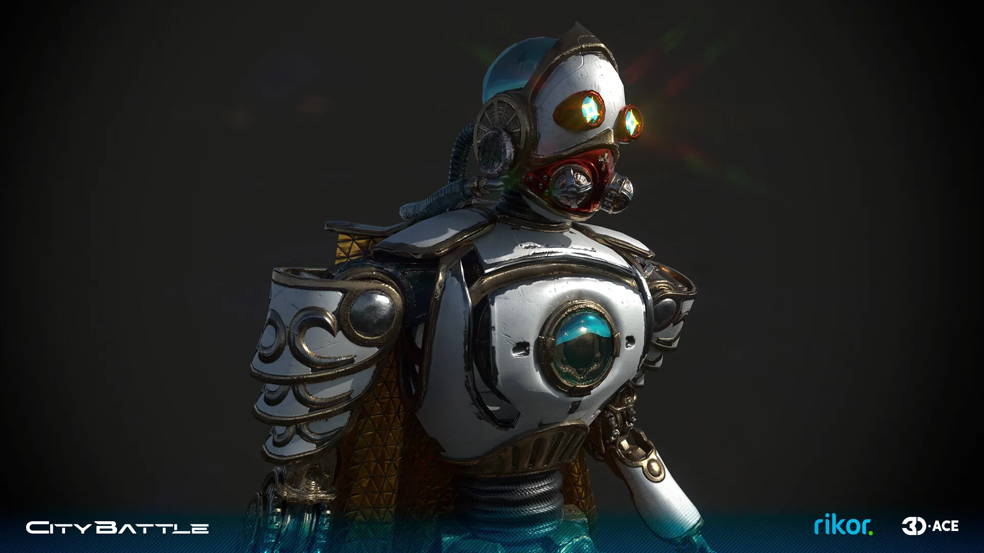
White carries the widest spread of meanings in character design. It can read as innocent and angelic, or it can read as sterile and unsettling. Storm Trooper armor in Star Wars is white, and so is Princess Peach. The hue does not pick a side; the surrounding cues do.
For a B2B production team scoping a new IP, the practical takeaway is that white needs strong supporting signals. White on a soft, pastel character reads sweet. White on a sharp angular silhouette with cold lighting reads as clinical or threatening. The choice belongs to the game concept art stage, not post-production.
Blue: composure, distance, and the default hero hue
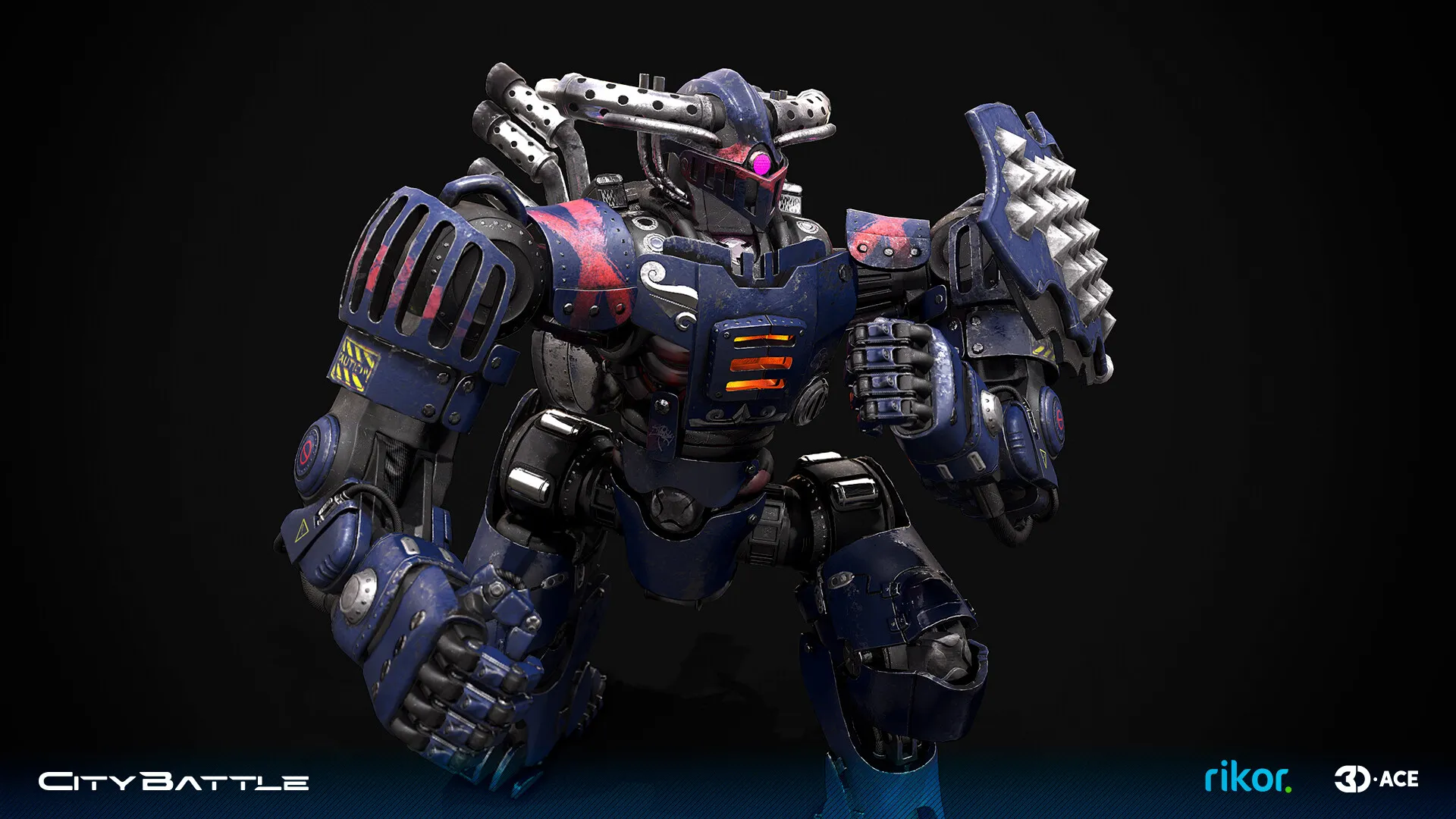
Blue is the default protagonist color in mainstream game design. Sonic, Mega Man, the Master Chief's armor, Sub-Zero in his own line of work, Crash Bandicoot's denim shorts, Link's classic tunic in earlier titles. Blue tests as calm, competent, and trustworthy, and it pairs cleanly with environment palettes that lean green, brown, or gray.
Search data on this topic confirms the public interest in blue characters. The query 'blue characters' ranks at position 1.82 with 67 impressions, and 'blue video game character' ranks at position 2.5. Players actively search for the pattern, which is one of the most stable signals in the color psychology of game characters. The hue's reliability is exactly why mid-tier studios sometimes step away from it deliberately, to avoid looking generic in a crowded market.
Green: nature, sickness, and the second protagonist color
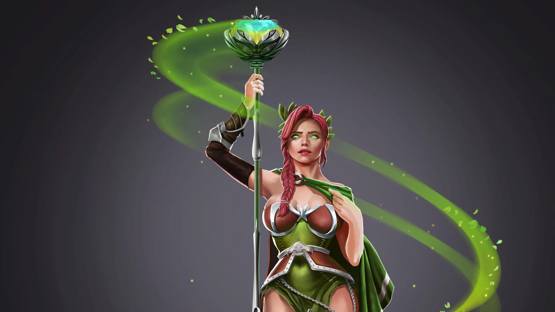
Green is the most versatile of the primary character colors. Saturated bright green reads as nature, growth, and life: Yoshi, the Hulk in his cartoon-bright runs, Princess Zelda's elf-coded supporting cast, Peter Pan in licensed titles. Desaturated or yellow-leaning green reads as illness, poison, or alien biology: classic Bowser, the Xenomorph palette, swamp monsters of every genre.
This query group performs at the top of the article's GSC profile. 'Green characters' ranks at position 1.07. 'Green video game characters' ranks at position 1.0. Real player interest sits in this segment, and the structural fix is to give the green section enough body to satisfy that intent.
For studio teams designing original IP, the rule of thumb is to pick a clear lane: saturated cheerful green for friendly characters, desaturated yellow-green for hostile or corrupted ones. Mixing the two on the same character without strong supporting signals creates ambiguity that players have to resolve before they can engage with the gameplay.
Red: passion, danger, and the villain default
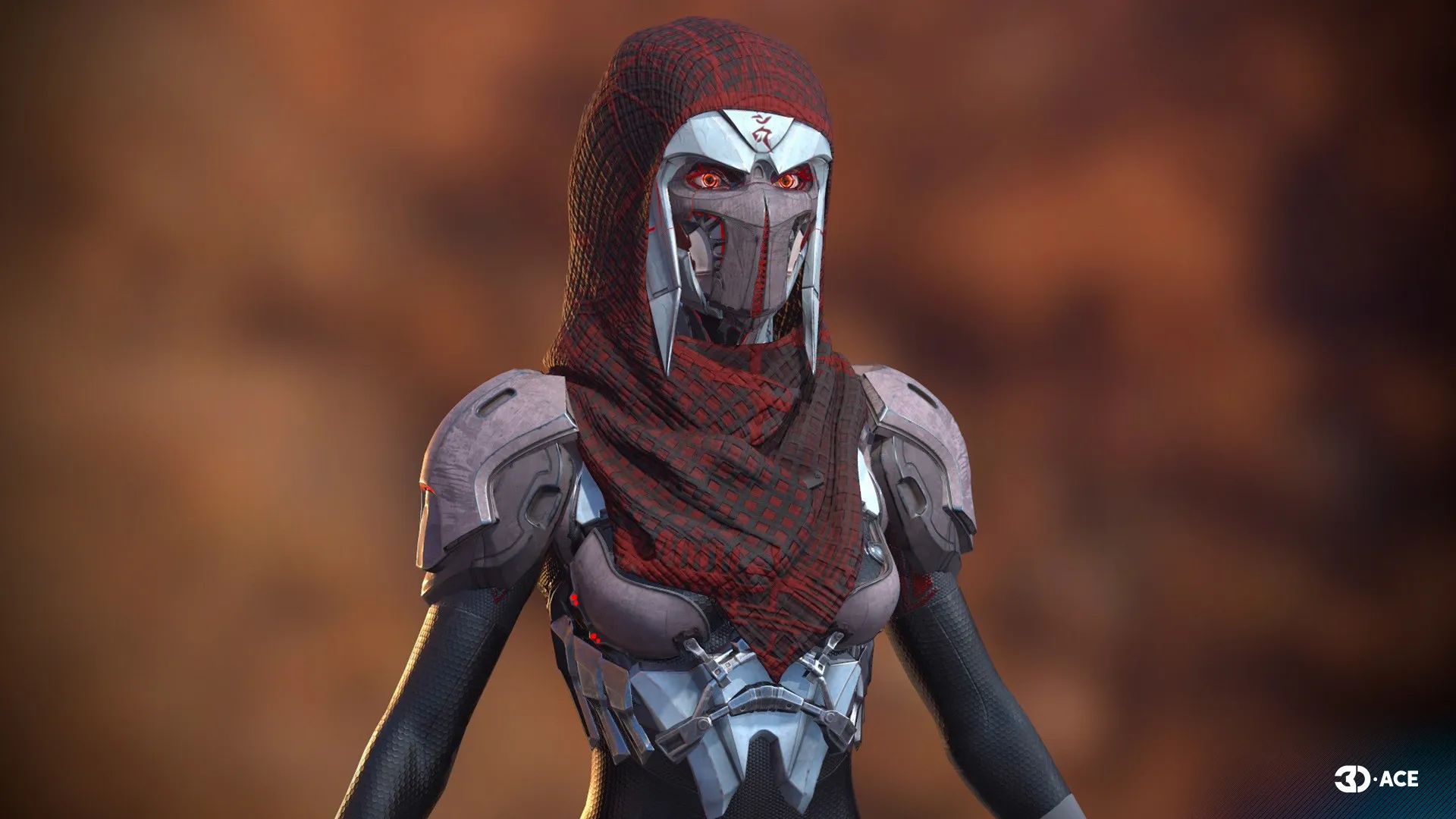
Red is the most emotionally loaded color in character design. It reads as passion, aggression, danger, and physical heat. Most game villains across the last four decades have used red at some point: classic Bowser's hair, Eggman's mustache and outfit, the Pac-Man ghost Blinky, Kratos's tattoo, Dante's red coat in the Devil May Cry series.
Redhead protagonists carry a different tone. Aloy from Horizon, Triss Merigold in licensed art, Princess Peach's red dress in some appearances, Mario's hat, red on a hero usually marks energy, courage, or focal-point design rather than threat. The same hue does different work depending on placement, saturation, and surrounding cues.
Pink, yellow, orange, purple: the supporting palette
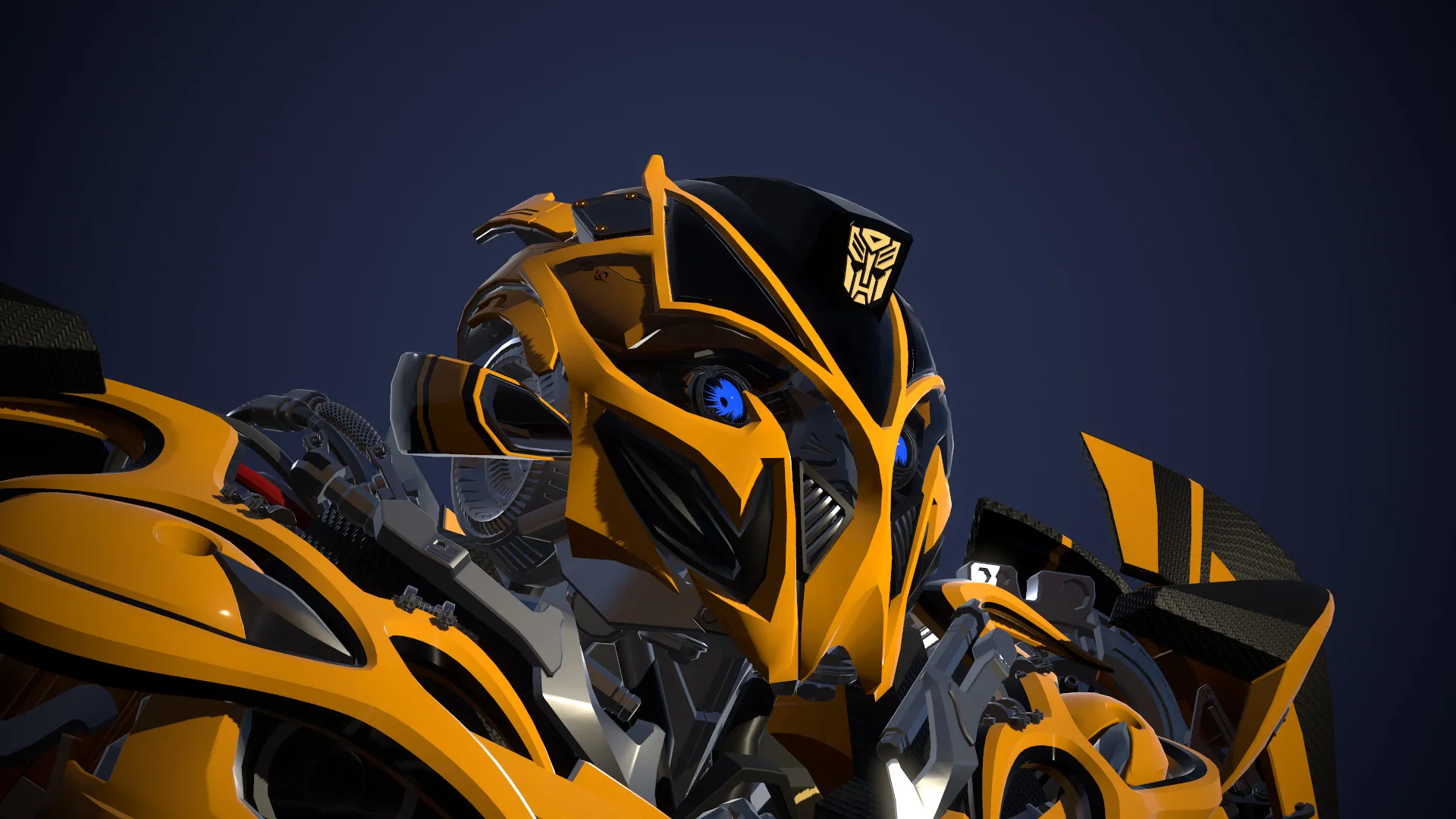
These four colors round out the character-design vocabulary.
Pink reads as tenderness, romance, or playful confidence. Kirby is pink. Princess Peach's dress is pink. Jigglypuff is pink. Recent designs have stretched the convention, pink-haired warriors, pink mechs, pink action heroes, but the base meaning still pulls toward warmth and approachability.
Yellow signals energy, optimism, and visibility. Pikachu, Pac-Man, Bumblebee, Mario's friend Wario. Yellow also doubles as a caution color in HUD design and weapon highlights, which is why protagonist yellows usually sit in a slightly warmer or more saturated range than the warning yellows used elsewhere in the same game.
Orange falls between red's intensity and yellow's friendliness. Garfield in licensed titles, Crash Bandicoot's fur, Naruto in licensed games, the classic Mario fire-flower state. Orange protagonists feel approachable but active.
Purple is the color of magic, royalty, and ambiguity. Waluigi, Wario's purple variants, witch and mage characters across countless genres, Twilight Sparkle in licensed titles. Purple villains often signal a higher-tier magical threat than red villains do.
From concept to delivery: color psychology of game characters in production
Translating the color psychology of game characters into a shipped asset is a multi-stage pipeline. The decisions made at concept art lock most of the work that follows.
Stage one is the mood board and palette block-in. The character designer pulls reference, sets a primary hue, picks one or two accents, and tests the silhouette in greyscale to confirm value separation. Stage two moves to colored line art and flat color passes, with palette swatches saved to the project's style guide. Stage three handles materials, shaders, and lighting in the target engine. By the time the character reaches animation and rigging, palette decisions should be locked, because re-coloring after the texture pipeline is set adds significant rework.
Game-Ace's game art design team handles this full pipeline for studios scoping new IP or refreshing existing characters. The team covers concept, 2D game art outsourcing and 3D game art outsourcing, and integration with the client's engine of choice. For more on style direction and how palette decisions sit inside a broader art-direction process, see video game art styles and video game concept art.
Game-Ace character art case
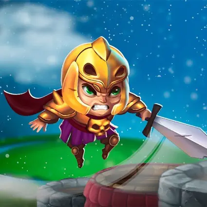
Welcome to Knight Stack Jump, a hyper-casual mobile game by Game-Ace
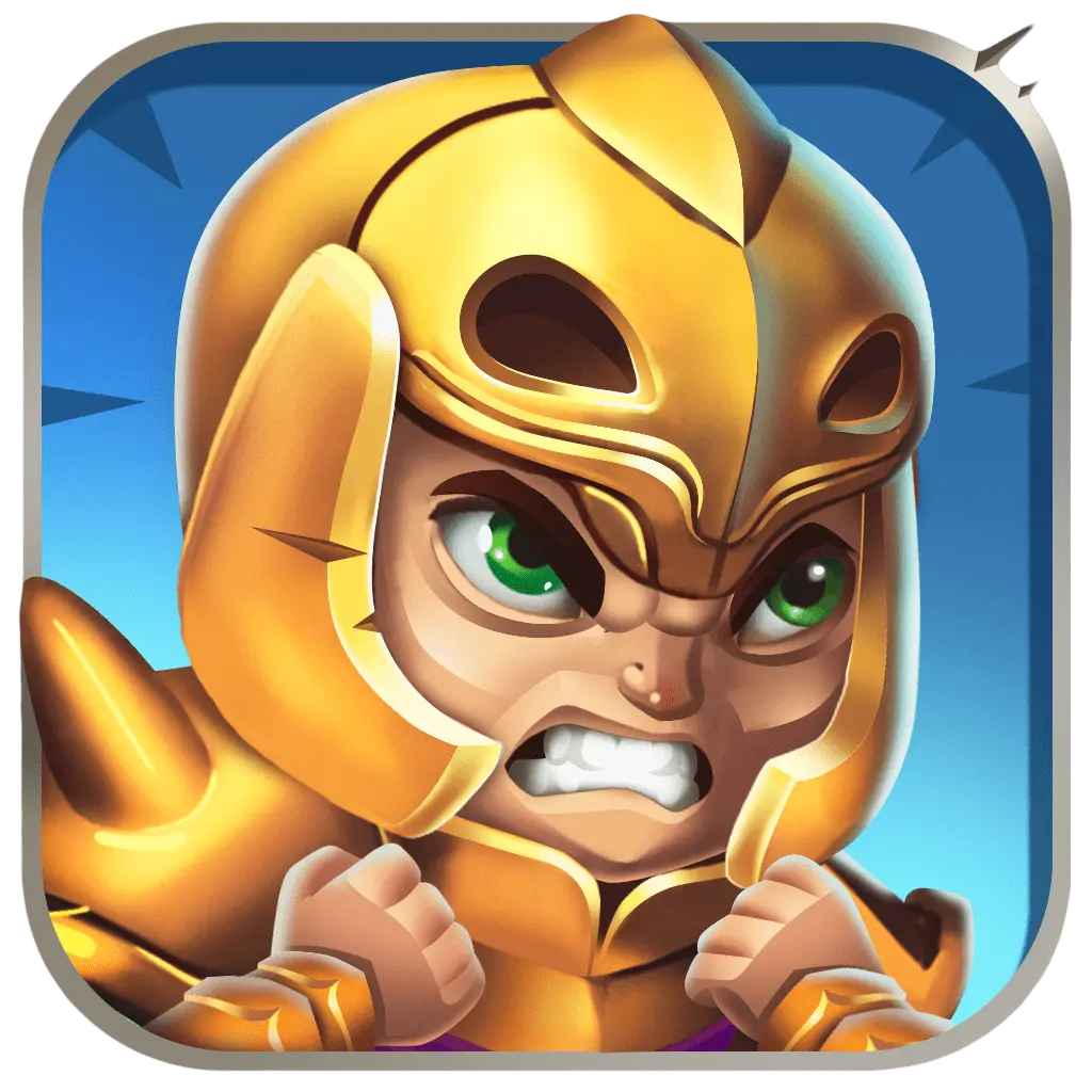
Knight Stack Jump is a hyper-casual title with stylized character art. The knight protagonist uses a primary palette to stay readable at App Store thumbnail size and during gameplay. Princess and enemy designs use clearly separated hues so children and casual players parse the scene quickly.
When to talk to Game-Ace about character color and visual design
If you are scoping character designs for a new IP, a color palette refresh for an existing game, or co-development on art direction, Game-Ace's character art and game development studio brings 21 years of production experience, 120+ in-house specialists, and 200+ delivered games to the brief. The team covers concept, 2D and 3D character art, rigging, animation, and engine integration under one roof, with strict NDA and full IP transfer on every project.
 How to design learning games for kids
  Arcade game design: a production guide
  Game environment design for production-ready worlds
  Narrative game design: from concept to shipped story
  Game UX: a practical guide for studios and product teams