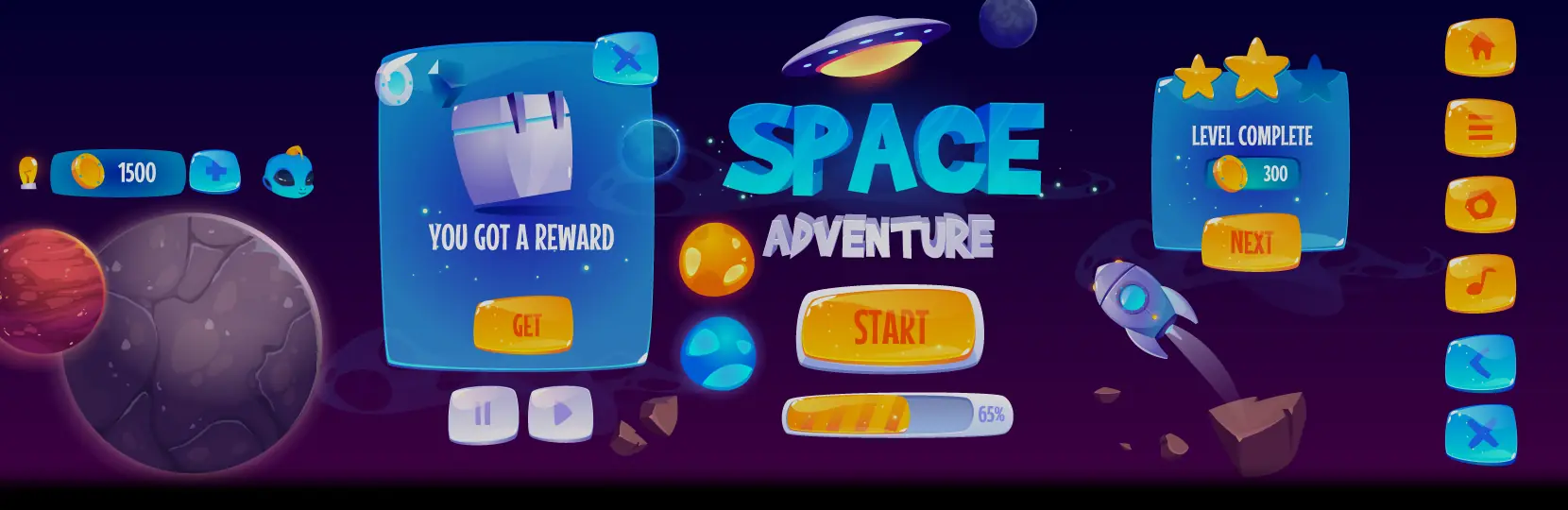

Effective game UI is the visual and interactive layer that lets players read the game state and act on it without friction. Strong game UI keeps the HUD readable at a glance, groups menu actions by task, and adapts to the input device the player is holding. It is a distinct discipline from UX: UX shapes the whole player journey and pacing, while game UI is the surface where that journey is drawn.
If you are scoping a new HUD, a UI refresh, or a full style guide, talk to Game-Ace.
Game UI vs game UX: where the line sits
Game UI is the layer players see and touch: HUD, menus, icons, buttons, prompts, cursor states, and interaction feedback. Game UX is the wider discipline of onboarding, pacing, difficulty, reward loops, and long-term retention, and the complete game UX guide covers that scope. UI produces mockups, HUD layouts, iconography sets, interaction states, and a style guide. UX produces flows, wireframes, playtest reports, and analytics plans.
HUD design: what belongs on screen

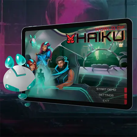
Flat
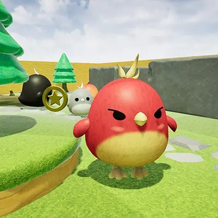
Bubble
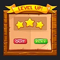
Wooden
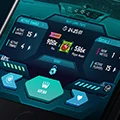
Futuristic
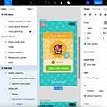
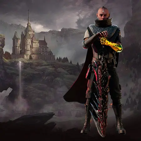
Custom
HUD design starts with a short list of information the player must have at all times. For a shooter, that usually means health, ammo, current weapon, and a minimap or objective marker. For a strategy game, it is resources, unit selection, and time. Everything else belongs in a menu, a pause overlay, or a contextual popup.
Readability at a glance is the test. A player in combat should be able to check health in under half a second, which means large enough type, sufficient contrast, stable position, and no animation that hides the number when it changes.
Menus and diegetic vs non-diegetic UI
Menus fail when the information architecture does not match how players think about the game. Group settings by task, not by engine subsystem. Video, audio, controls, and accessibility belong at the top; developer or debug options belong out of the main flow. Pause menus deserve extra care because players open them mid-tension, keep the resume action large and in a stable position.
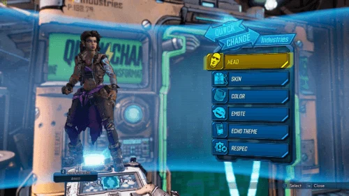
Borderlands 3
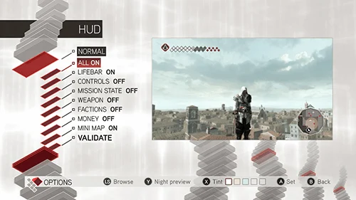
Assassin’s Creed 2
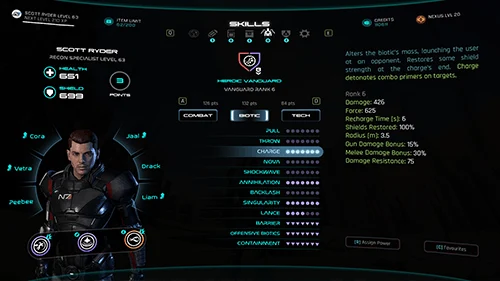
Mass Effect Andromeda
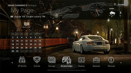
Gran Turismo 5
Non-diegetic UI sits over the game world, a health bar in the corner, a minimap in the top right, fast to read and easy to iterate. Diegetic UI is drawn inside the world, a health indicator on the character’s armour, a compass on a wrist device, supporting immersion but taking more art time. Most shipping games use a hybrid: diegetic elements where the pace allows and non-diegetic overlays where speed matters.
Mobile touch UI and safe zones
Mobile game UI has to respect the physical hand. Interactive elements need a minimum touch target of roughly 44 to 48 pixels on standard density, and controls should sit inside the reachable arc for thumbs. Safe zones are the region of the screen that stays visible and free of system overlays, excluding the notch, the home indicator strip, and rounded corners. Portrait and landscape need separate layouts, a single scaled layout usually breaks either thumb reach or text density on one orientation.
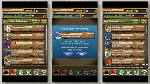
Rage of Bahamut
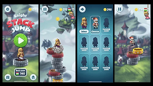
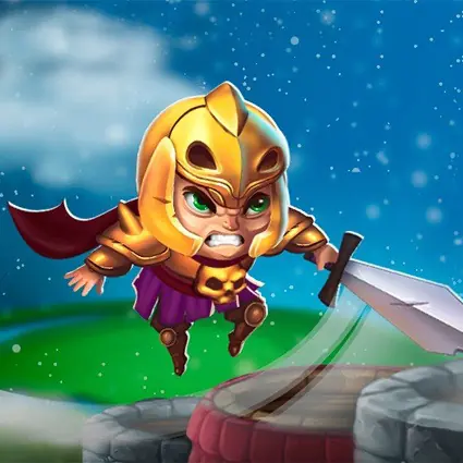
Knight – Stack Jump
Controller UI and accessibility
Controller UI adds constraints that touch and mouse-keyboard do not. Menus need a clear focus state, predictable navigation order, and a visible cursor or highlight. A useful rule is that every UI screen must be fully operable on the slowest input device the game supports.
Accessibility widens the audience and, in many markets, is a procurement requirement. Baseline options include adjustable text size, high-contrast HUD, colourblind palettes for gameplay-critical colours, remappable controls, and subtitle background. The WCAG 2.2 guidelines from the W3C give useful contrast ratios and text targets that transfer well to game UI. Colour alone should not carry meaning, if a friendly unit is green and an enemy is red, add a shape or icon difference as well.
Style guide and tools
A UI style guide documents type ramp, colour palette, iconography rules, spacing tokens, interaction states, and motion language. Without it, each new screen drifts and the game accumulates small inconsistencies. For visual foundations, see game art design and 2D game art.
Figma is the current standard for UI mockups and style guides. In-engine, Unity offers UGUI, the mature system most shipping mobile games use, and UI Toolkit, a newer retained-mode system with USS styling well suited to data-driven menus. Unreal uses UMG, a designer-friendly layer over the Slate framework.
Iteration and playtesting for game UI
Game UI is rarely right on the first pass. Ship the first version into a playable build, watch new players read the HUD and open menus, and note every place they hesitate, misclick, or ask a question. Small structured playtests, five to eight participants per round, catch most UI issues before wider testing.
Common HUD approaches
The table below summarises the four common HUD approaches and where each fits best.
| HUD approach | What it looks like | Best-fit genres | Best-fit platforms |
| Minimal HUD | Only critical info shown; elements fade in when relevant. | Exploration, walking sims, atmospheric adventure. | PC, console, high-end mobile. |
| Full HUD | Health, ammo, minimap, objectives always visible. | Shooters, MOBAs, MMORPGs, strategy. | PC, console, tablet. |
| Diegetic UI | Info drawn inside the world on the character or gear. | Immersive sims, survival, VR titles. | PC, console, VR. |
| Hybrid | Diegetic flavour plus non-diegetic overlays for speed. | Action RPGs, shooters, adventure with combat. | All platforms. |
A game UI case from the Game-Ace portfolio
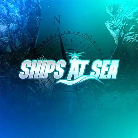
Welcome to Ships At Sea, a maritime simulator by Game-Ace
Ships At Sea is a large-scale multiplayer maritime simulator built in Unreal Engine 5, where Game-Ace’s team supported readable feedback for water interaction and weather transitions so commercial fishing and cargo operations stay clear to players in a busy multiplayer scene.
When to talk to Game-Ace about game UI
Game-Ace has designed and shipped game UI across mobile, PC, console, and VR since 2005, with a 120+ specialist team covering UI design, engineering, art, and QA. If a HUD refresh, new menu system, or platform port is on the roadmap, Game-Ace’s custom game development studio can plan the scope, produce the mockups, and deliver the in-engine implementation as a full-cycle or co-development engagement. See also hire game artists.
 How to design learning games for kids
  Arcade game design: a production guide
  Game environment design for production-ready worlds
  Narrative game design: from concept to shipped story
  Game UX: a practical guide for studios and product teams